Shop2Shop Brand Guidelines 2024
Our typographic implementation is clear, transparent, and easy to understand, while also remaining adaptable and dynamic.
Outlined below are fundamental layout examples that align with our brand’s essence.

It is important to note that Rubik is never employed for supergraphics or larger text elements, preserving its role in maintaining optimal legibility in body content.

Our selection of Neue Alte Grotesk font encompasses three distinct weights: Heavy, SemiBold, and Regular.
When to use each weight:
When employing supergraphics, a Heavy weight is used to ensure an impactful visual presence.
For various textual elements such as headlines, lead-ins, headers/footers, and body copy, the Regular weight offers optimal legibility and aesthetic balance.
Subheadings, on the other hand, find their ideal expression in the SemiBold weight, striking a harmonious blend of prominence and readability.
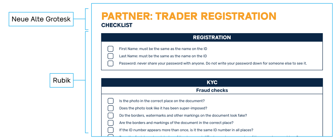
Basic layout example
The use of type should be both clear and consistent as well as flexible and dynamic. Neue Alte Grotesk should always be used for top-level headings, while Rubik should always be used for body copy (including some subheadings).